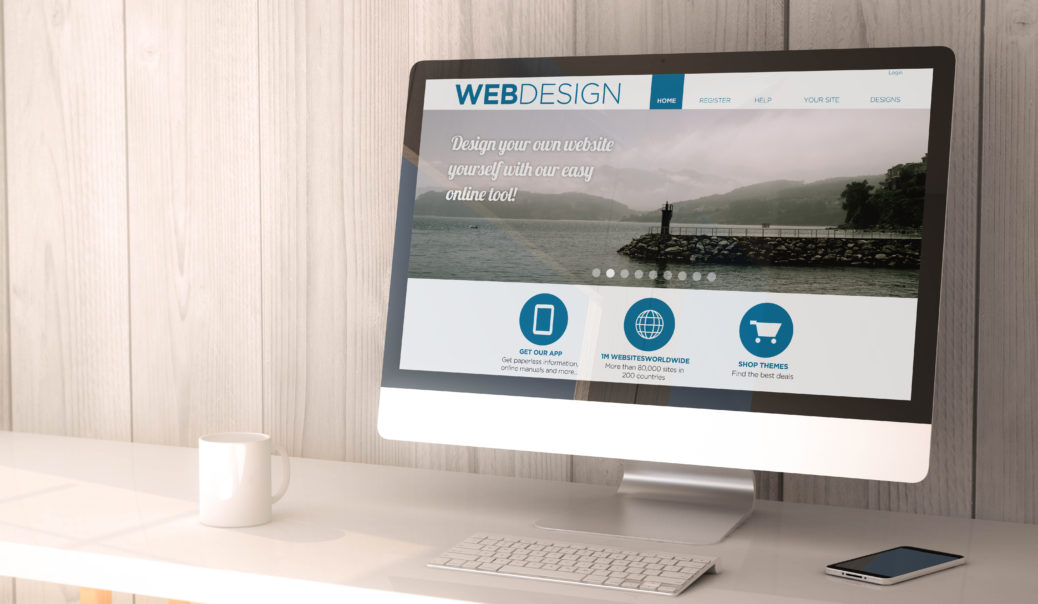
A business’ website typically makes the first impression to potential customers. Therefore, it is crucial that the web design is both functional and user-friendly. Your website can make or break your venture and here are a few things to avoid if you want it to look the part. Below are five common web design mistakes that all businesses should avoid.
Be Clear About Your Products or Service
The estimate varies of how long you have to engage viewers to stay on your website, but it is thought to be just 4 or 5 seconds. If they stay for 10 seconds or more you are doing well. This is why the first page they see needs to be very clear about your products or service. In addition, express how useful your products are and why potential customers should buy from you. Take a look at a few competitor websites and see if you can point out the mistakes.
It Must Be Responsive To All Devices
Regardless of the type, mobile devices must be considered in your web design strategy. Mobile phones, tablets, and laptops are commonly used for purchases in many industries. Users these days expect to have the same experience regardless of the device. This is when you may have to call in the experts for assistance (see https://fullscale.io/8-common-offshore-software-development-challenges/). They will ensure all of your customers can view your website on any device for a reasonable fee.
It May Be A Slow Loader
As an entrepreneur, the last thing you want is a slow loading website. Consumers are used to fast and responsive purchasing and tend to lose patience quickly. It is not just the loading of the first page you have to consider. If it takes a long while to move from page to page they will not hang around for that to happen.
It Must Be User-Friendly
There are many things that can affect the user-friendliness of your website. The font could be too small for easy reading, or the color of the type be unreadable on the background color. Users will not be impressed if they need to squint to read the content of your pages.
Your website needs to be easy for customers to navigate from one page to another. To accomplish this, be sure to have clearly marked tabs at the top. Use a checklist to help ensure you don’t miss anything (see https://www.socialmediatoday.com/userfriendly). It might seem a little daunting, but it’s actually pretty easy to get your site up to standard.
Put Social Media At The Bottom
Social media is a great marketing tool and it could well be that it is how they have linked to your website. However, it is a common mistake to put the social media icons at the top of a page so that these can be the first things the user sees. Now you have the users on your site you do not want them going straight to a social media platform, so keep the icons at the bottom of the pages where all your other details are.
Avoiding some of these mistakes will hopefully make your website the success you want it to be.
Be sure to hop into the Savvy Entrepreneur Private Facebook Community to collaborate, learn and grow with your fellow entrepreneurs and business owners.
Similar Posts by Savvy Entrepreneur:
10 Income Reports by Entrepreneurs for Entrepreneurs
https://savvyentrepreneur.co/10-income-reports-by-entrepreneurs-for-entrepreneurs/
Get More Customers Using Your Website, Email Marketing, and Social Media
https://savvyentrepreneur.co/get-more-customers-using-website-email-marketing-social-media/
Mastermind Groups for Entrepreneurs Foster Accountability
https://savvyentrepreneur.co/mastermind-groups-for-entrepreneurs-foster-accountability/
This is a Collaborative Post


