
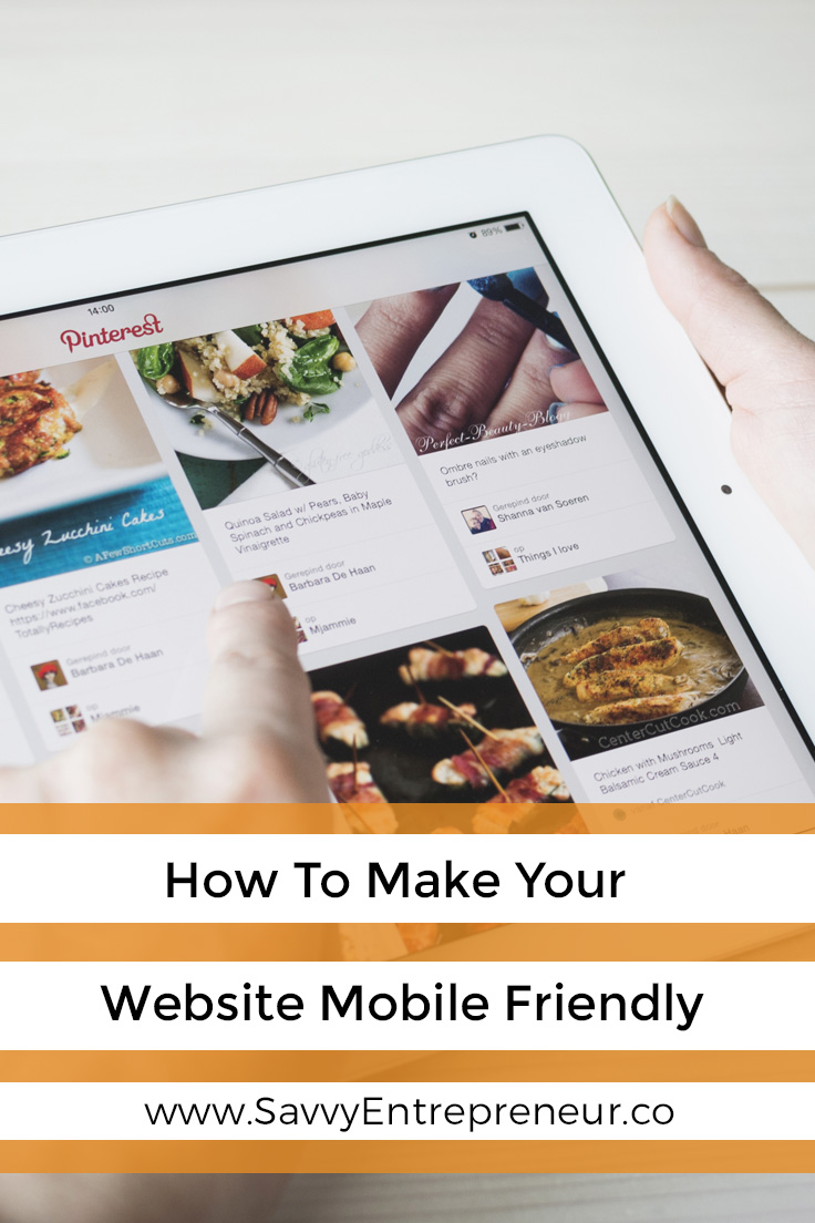
Mobile technology is taking over the world, which means it’s permeating into the business industry. More than 3 billion people worldwide own a cell, and 50% of these devices have access to the internet. Nearly one-third of purchases are being made via a mobile phone in 2018, and the figure is set to skyrocket. To compete in the digital age today, you must make your website mobile friendly. Any companies that aren’t on board with the revolution will get left behind.
Leave It Alone
Yep, the first tip doesn’t require you to do much as long as the site is all-in-one. What does this mean? In simple terms, it’s to do with the platform adapting to the preference of the user. The right IT support group will be able to ensure that, depending on the device, the browsers are redirected to the correct platform. Because it’s fully responsive, everything should look fantastic whether customers use a smartphone or a laptop. Replicating content for two different sites is a surefire way to annoy Google, which is a terrible idea.
Use Responsive Design
Don’t forget that certain elements are flexible and can shift. Take images as an example. It’s easy to view them as rigid because they have dimensions. And, if the platform doesn’t take them into account, then they won’t fit the screen. Instead, they become pixelated and look ugly. Responsive photos are different because the images can change their layout accordingly. By recognizing the user’s screen size (yes, it’s a thing), the site will morph into a viewable webpage. The same goes for cascading stylesheet media queries too.

Opt For YouTube
Videos aren’t the same as images as they are pretty complicated. Trying to get them to respond, then, is hard work. It is possible, but you’ll need to have lots of spare time and energy on your side. Usually, people who aren’t web developers can side-step this issue by using YouTube. The reason is the embed code as it’s already responsive and therefore limits the hassle. YouTube videos can add an interactive element without damaging the layout. There is nothing to say you can’t use videos from other sources, but be mindful of the extra steps involved.
Test It
One of the biggest mistakes you can make is to coast along. After everything is in place, it’s tempting to think that the job is over. Mobile users will get redirected and the business can milk the exposure. Sorry, but this is a negative attitude because features break all of the time. Plus, the elements may work for one device but not another. Android is different from Apple. Testing how it works on different platforms is essential, as is testing separate pages.
Is your site mobile-ready? Have you tested it enough to know the answer to this question?

Be sure to hop into the Savvy Entrepreneur Private Facebook Community to collaborate, learn and grow with your fellow entrepreneurs and business owners.
Similar Posts by Savvy Entrepreneur:
10 Income Reports by Entrepreneurs for Entrepreneurs
https://savvyentrepreneur.co/10-income-reports-by-entrepreneurs-for-entrepreneurs/
Get More Customers Using Your Website, Email Marketing, and Social Media
https://savvyentrepreneur.co/get-more-customers-using-website-email-marketing-social-media/
Mastermind Groups for Entrepreneurs Foster Accountability
https://savvyentrepreneur.co/mastermind-groups-for-entrepreneurs-foster-accountability/
This is a Collaborative Post


